Streamlining Returns at Decathlon Digital
Summary
Returns was the top source of negative feedback across 10 countries at Decathlon. We redesigned the entire journey, from account dashboard through confirmation, so customers could handle returns autonomously without calling support.
Overview
Role: Senior Product Designer, Post purchase team
Platform: Web (responsive, mobile and desktop)
Scope: Returns journey across account dashboard, order details, returns flow, FAQs and support (50+ pages and states)
Team: PM, UX researcher, engineering manager, developers, senior content designer, returns logistics managers
Context and Problem
Context
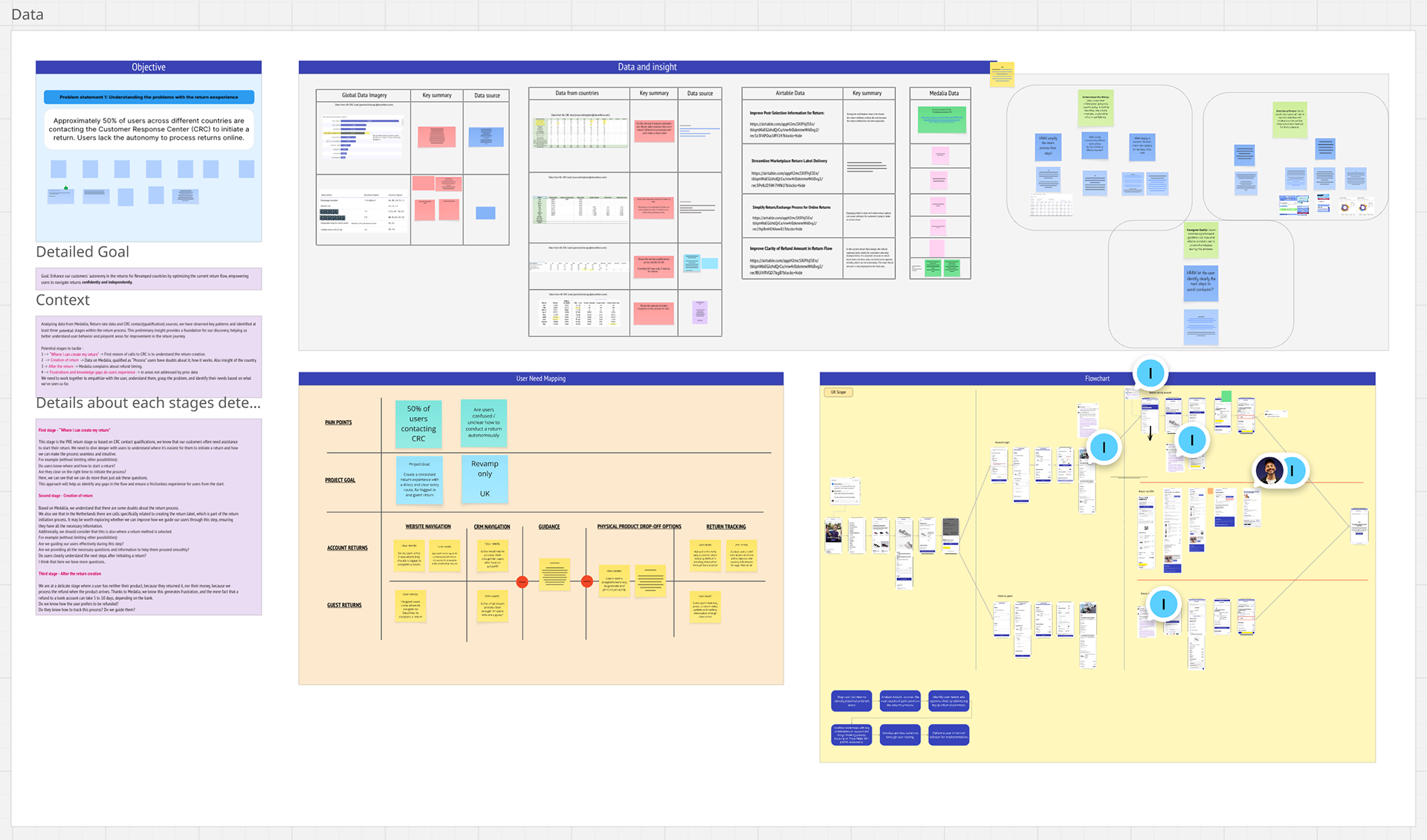
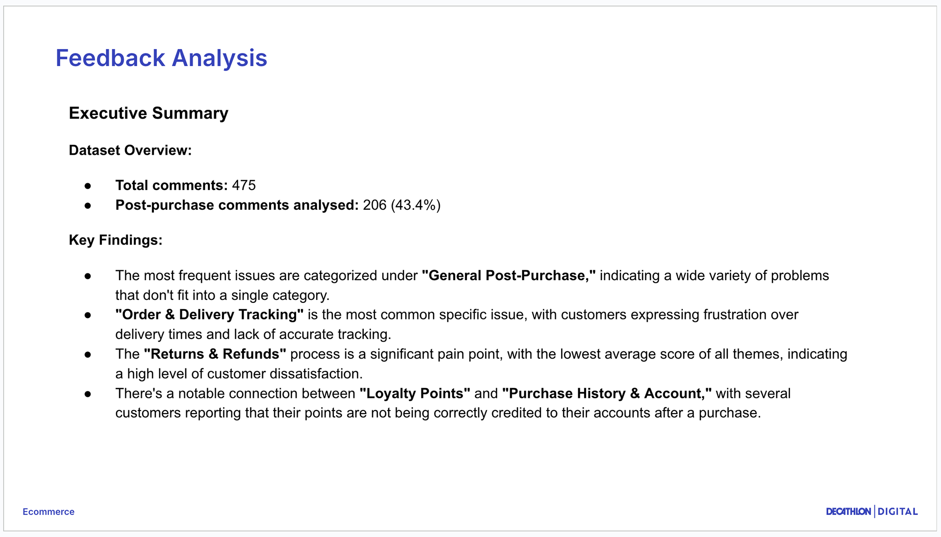
As part of the post purchase area at Decathlon Digital, we ran a monthly Medallia analysis using an internal Gemini based tool I created. Each month we reviewed more than 1,000 comments from 10 countries.
“Returns” showed up almost every month as a top source of negative feedback.
Key issues from customers:
- Starting a return was not intuitive.
- Getting a return label was confusing.
- After finishing the flow, people did not know what to do next or when to expect their refund.
Examples from feedback:
“Improve the return processes, which are very easy and fast elsewhere; at Decathlon, telephone intervention is necessary.”
“I sent the item back, but I never got any confirmation of when the refund would happen.”
We framed the work as Streamlining returns and treated it as a core post purchase journey, not just a single page fix.
My role
I was responsible for the end to end UX of the web returns experience. Concretely, I:
→ Led the monthly Medallia feedback and CSAT analysis using the Gemini Gem I designed, surfacing returns issues and trends for the team.
→ Took part in discovery workshops led by our UX researcher, using data and current flow reviews to define problems and opportunity areas.
→ Designed flows, wireframes, and interface designs for the new returns journey on mobile and desktop.
→ Worked closely with PM, engineering manager, tech lead, developers, content designer and returns logistics experts.
→ Brought the work into design reviews with the wider lower funnel team and refined designs after user testing.
→ Used our future vision work for post purchase to align the new returns journey with where we want the experience to go.
Approach
Understanding the current journey
→ Audited the returns experience across account dashboard, order history, order details, help and support.
→ Combined Medallia feedback, data from Customer Representative Center leads, and discovery research to map pain points.
→ Summarised this in a simple journey and opportunity map for the cross functional team.
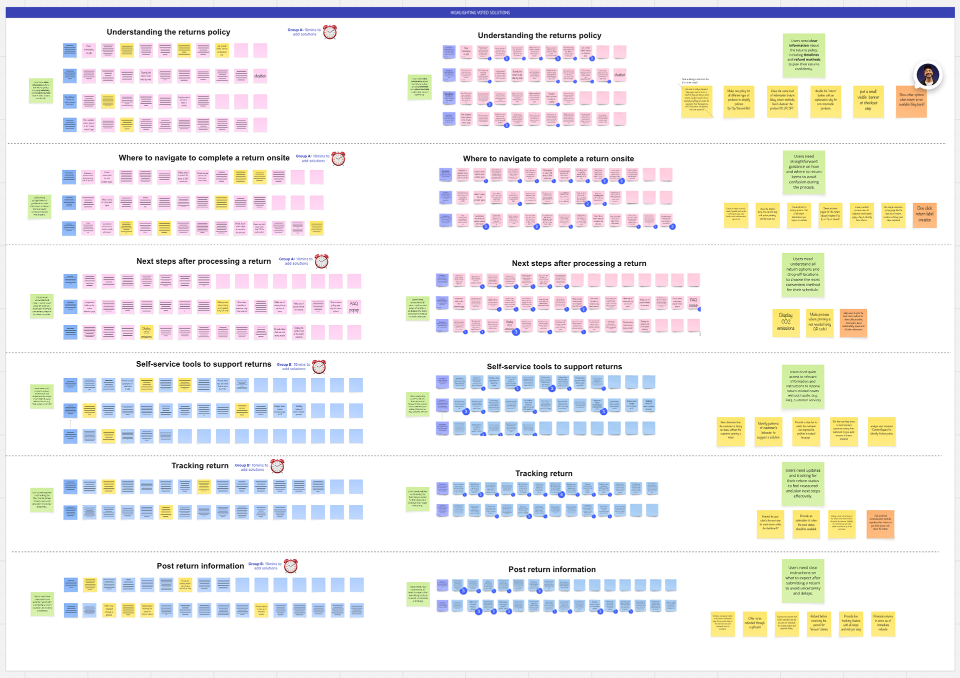
Co defining problems and opportunities
In a series of workshops with UX researcher, PM, engineering, content and logistics experts we:
→ Reviewed feedback and current flows together.
→ Defined “How might we” questions around starting a return, understanding options, and clarity after completion.
→ Prioritised opportunity areas that balanced customer pain and feasibility.
→ From this I owned the design work on the main returns journey.
Designing the new returns experience
Entry points
→ Added a clear “Start a return” path directly from the account dashboard and menu so customers do not have to dig through past orders.
→ Improved entry from order details, so people who are already looking at a specific order can start from there as well.
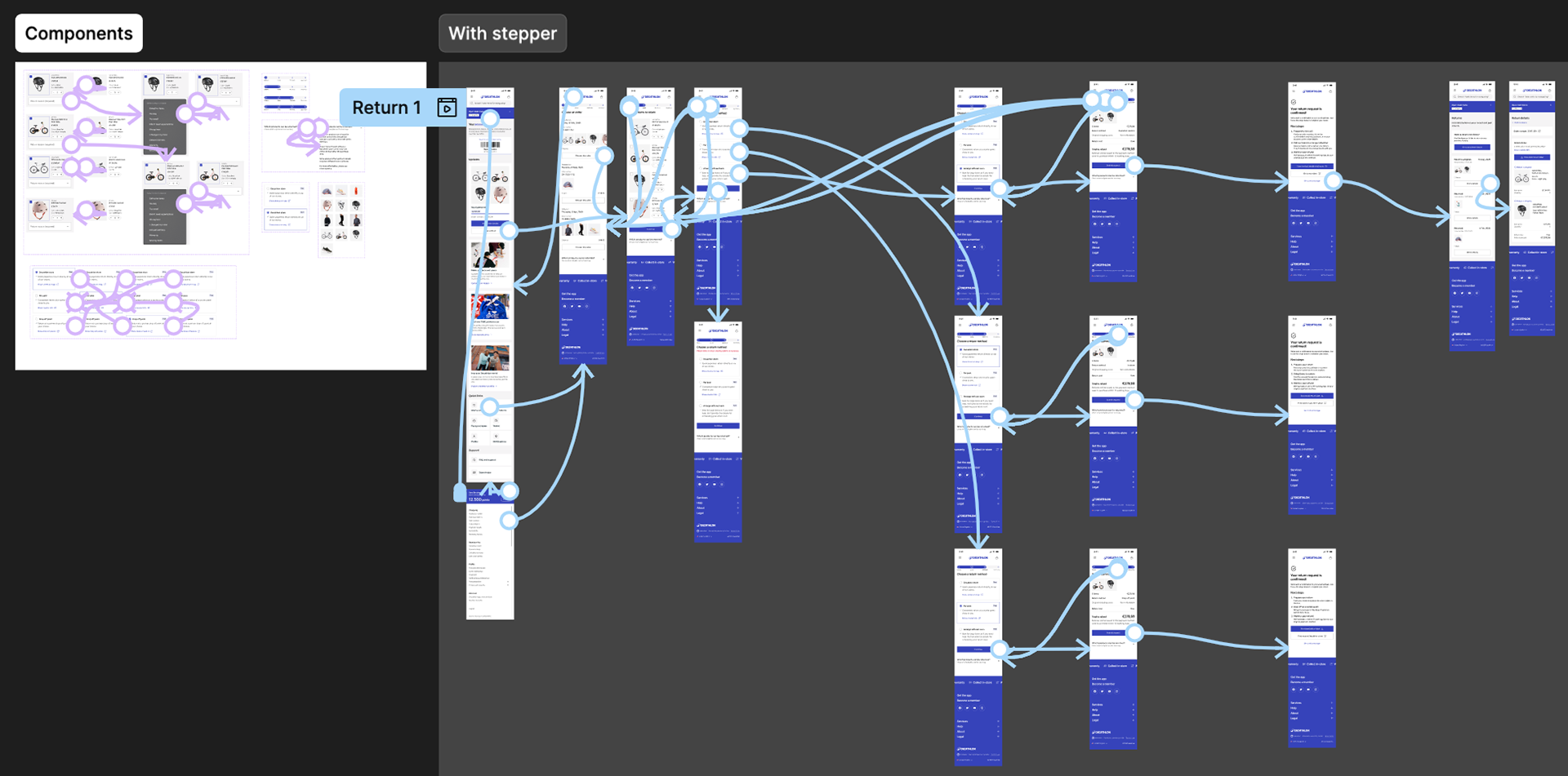
Returns flow
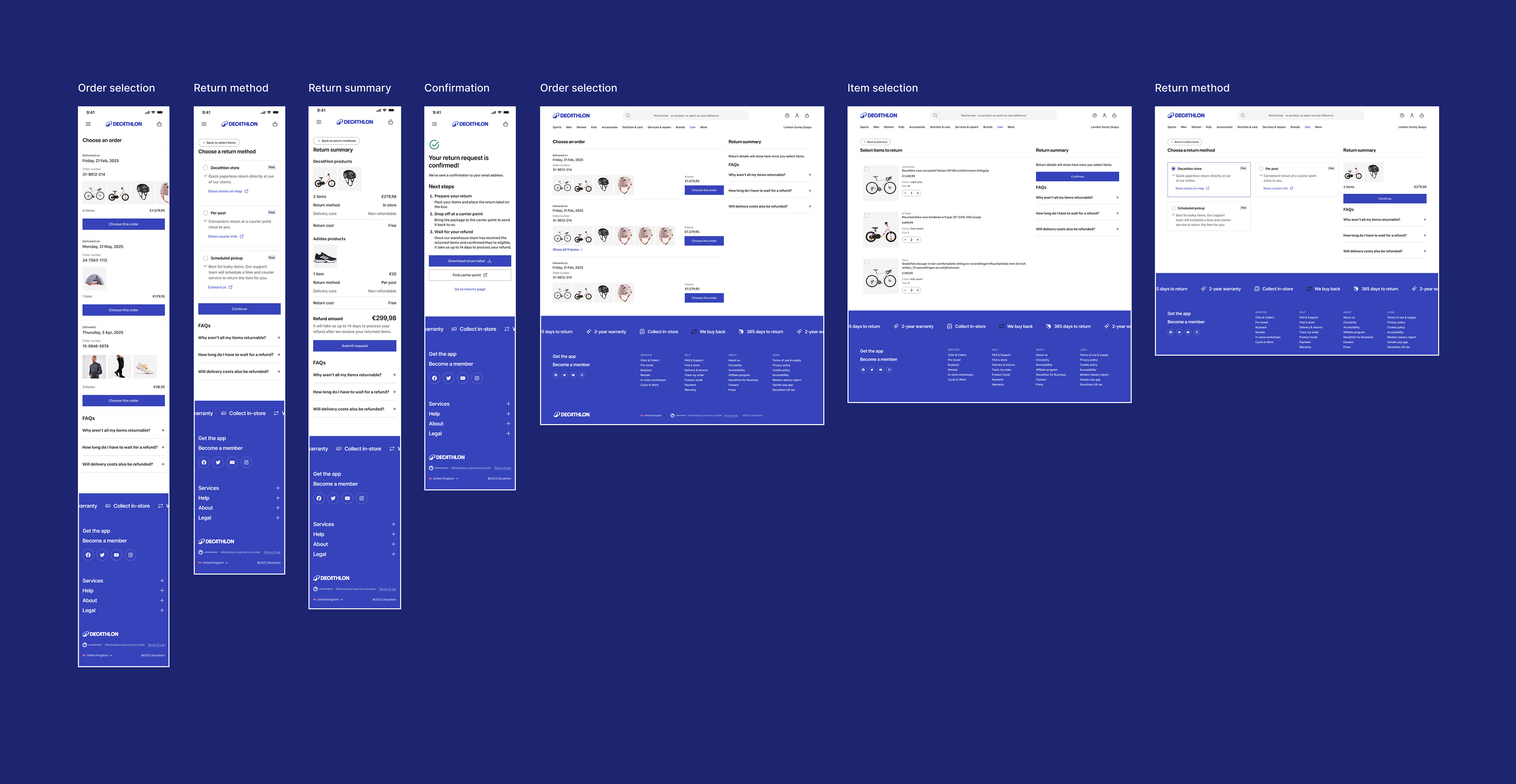
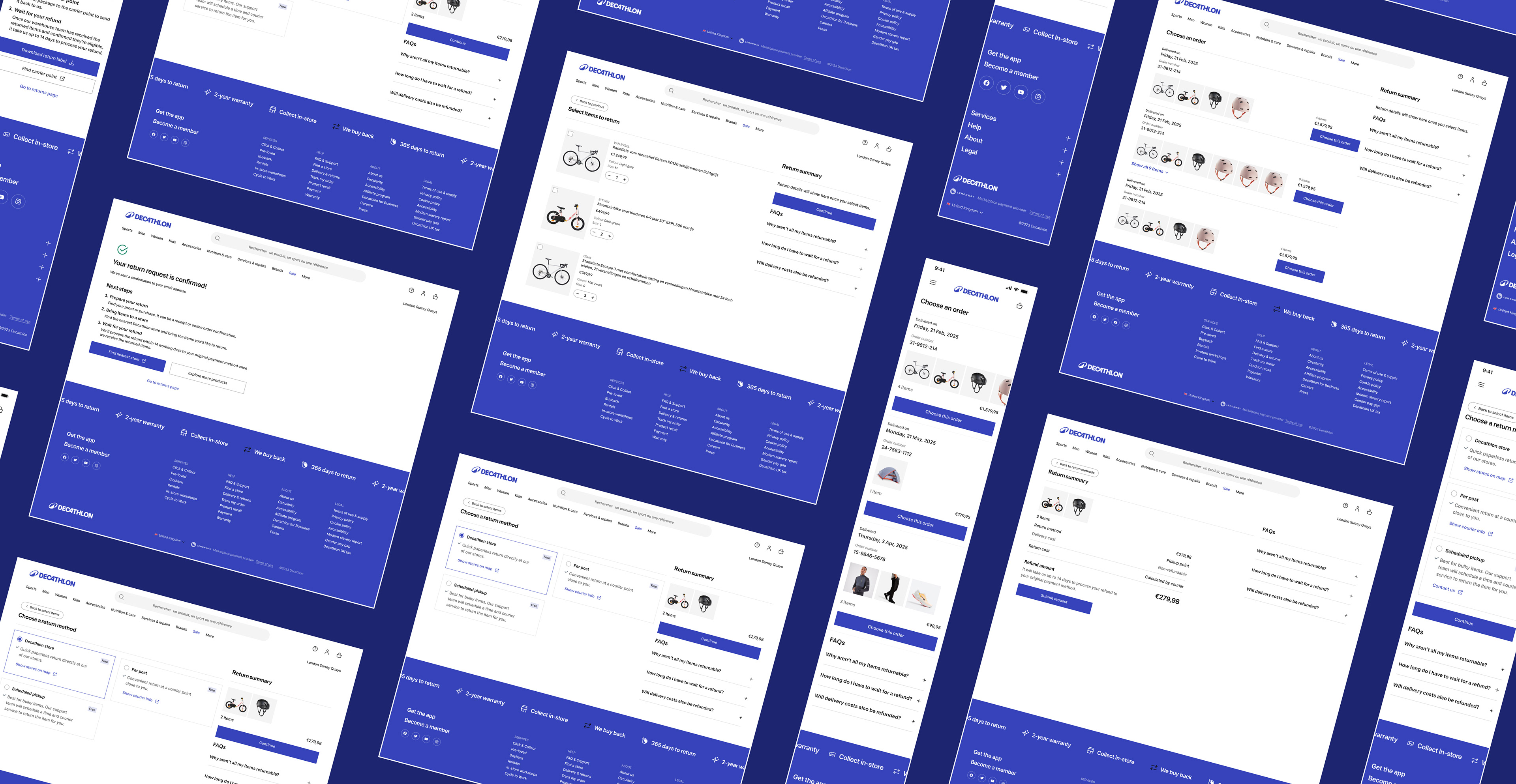
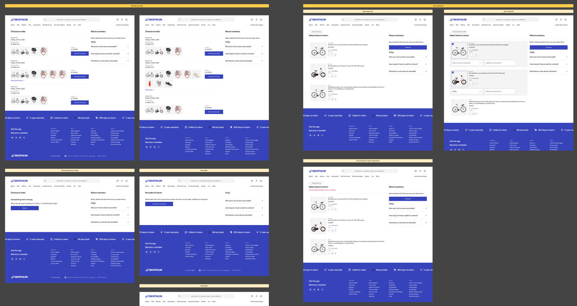
I designed a single, easy to follow flow with:
→ Order selection (if started from dashboard)
→ Item selection (with return reason)
→ Return method
→ Summary and confirmation with clear next steps
Along the way customers see relevant FAQs and can jump to broader help and support pages if they need more detail.
Handling complexity and edge cases
Together with logistics and engineering we mapped and designed for:
→ Marketplace orders versus Decathlon products
→ Bulky items that require different handling and methods
→ Different return methods and what they mean for return labels, drop off and pick up
→ Multiple confirmation states that explain what happens next for each scenario
I paid particular attention to the return summary and confirmation states, laying out clearly what the customer chose, what they need to do now and when to expect their refund.
Patterns and design system
→ Explored and tested multiple progress indicators that work well for multi step flows and can scale to other journeys.
→ Designed patterns for showcasing multiple products through a flow that other teams could reuse.
→ Collaborated with the design system team so these patterns could be built once and applied in other parts of the lower funnel.
Collaboration and decision making
→ Brought the content designer and UX researcher into constraint discussions with engineers so we refined flows together instead of in silos.
→ Negotiated design changes when technical limitations around APIs and order selection appeared, while keeping the core experience intact.
→ Accepted a temporary navigation compromise due to technical concerns, then steered the team back to the original, clearer solution after user testing showed it worked better for customers.
Outcomes and reflection
The redesigned returns journey is now live. It is designed to:
→ Make starting a return from the account feel obvious and intuitive.
→ Clarify return methods and labels so users don't need to call support and act autonomously.
→ Set clear expectations on what happens after a return and when refunds arrive.
→ Offer scalable patterns that the design system and other lower funnel teams can reuse.
For me, this project brought together:
→ Continuous feedback analysis at scale (through the Gemini Medallia workflow).
→ Cross functional discovery and opportunity framing.
→ Detailed interaction design for a complex, operationally heavy flow.